Table of Contents
Many years ago a business friend was massively defrauded by a senior staff member. Some fraudulent cheques were easily shown to be so by a handwriting expert and the bank bore the cost; other cheques were in doubt. Excel was a fairly new tool back then, so he asked me for assistance.
I loaded all the data available into a spreadsheet, diced and sliced it, sorted it various ways and it became apparent from the known fraudulent cheques that there was a pattern. Any cheque presented on a Friday for under $5,000 was likely to be a fraud. This data was given to the bank and over $1 million more was quietly refunded by the bank to my friend’s business.
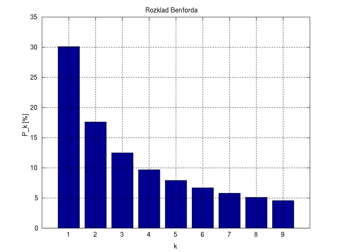
Patterns are everywhere. One important pattern is described by Benford’s Law. Wikipedia tells us:
Benford’s law, also called the Newcomb–Benford law, the law of anomalous numbers, or the first-digit law, is an observation about the frequency distribution of leading digits in many real-life sets of numerical data. The law states that in many naturally occurring collections of numbers, the leading digit is likely to be small. For example, in sets that obey the law, the number 1 appears as the leading significant digit about 30% of the time, while 9 appears as the leading significant digit less than 5% of the time. If the digits were distributed uniformly, they would each occur about 11.1% of the time. Benford’s law also makes predictions about the distribution of second digits, third digits, digit combinations, and so on.

It has been shown that this result applies to a wide variety of data sets, including electricity bills, street addresses, stock prices, house prices, population numbers, death rates, lengths of rivers, and physical and mathematical constants. Like other general principles about natural data—for example the fact that many data sets are well approximated by a normal distribution—there are illustrative examples and explanations that cover many of the cases where Benford’s law applies, though there are many other cases where Benford’s law applies that resist a simple explanation. It tends to be most accurate when values are distributed across multiple orders of magnitude. […]
All very interesting, I hear you say. So what?
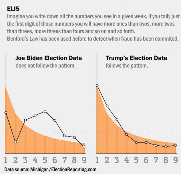
I have not gone through every source data point to verify this graph but it does look intriguing.

But then again, they wouldn’t lie to us now, would they?
Remember, if you are going to make up ‘random’ data, it needs to follow the appropriate pattern.
If you enjoyed this BFD article please share it.


