
Table of Contents
In Alan Garner’s excellent, unsettling children’s fantasy, Elidor, the world of Elidor is stripped of colour and reduced to a lifeless, dead world. Only the distant castle of Gorias remains as a beacon of light and colour. Unless four English children, from equally grim 1960s Manchester, can save it.
If only they could save our world.
Every aspect of life is being stripped of color.
Many have noticed this trend – but why exactly is it happening?
Colourlessness is as synonymous with Soviet-style authoritarianism as Brutalist architecture – what Robert Hughes called ‘the architecture of power’. So is homogeneity. A post-Soviet comedy featured a drunk Russian who flies ‘home’, finds his apartment block, and lets himself into the apartment with his own key. And in the morning realises that it’s not only the wrong apartment and block, he accidentally boarded a flight to a completely different city.
The same dreary homogeneity is suffusing Western culture, in everything from entertainment to cars and architecture.
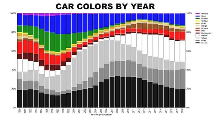
Look at car colors since 1990.
Paint suppliers are seeing huge shifts toward black, gray, silver and white color preferences. Eighty per cent of new cars are now grayscale.
Ridley Scott’s “Napoleon”-made sets and costumes that are vibrant in reality look utterly lifeless on screen.
Muted color grades (that blue/gray wash over everything) are the new normal in cinema.
This trend really began with the Matrix films. When directors found that, thanks to digital video, they could make colour-grade changes that were either laborious or impossible with film, single-colour palettes began to wash over cinema. But at least The Matrix’s universal green was a colour. When Luca Guadagnino remade Dario Argento’s legendary Suspiria, he reversed nearly all of Argento’s aesthetic choices (the remake is still a remarkably good film, by the way). Goblin’s blaring rock soundtrack was replaced by a moody, low-key piano-heavy score by Thom Yorke. More tellingly, Argento’s saturated giallo colour palette was reduced to a monochromatic blue-grey.
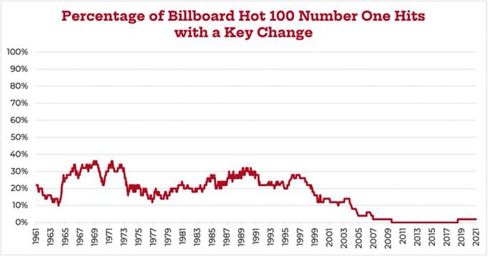
But it’s not just cinema. In music, too, homogeneity rules. The proportion of Top-40 music today with even something as simple as a key change has dropped to near zero.
Why is this happening?
Partly, it’s technology. As music YouTuber Rick Beato points out, as in cinema, technology has had a profound effect on making music. Making music today is exponentially easier, thanks to sampling. But, in practice, that means producers are relying more and more on a narrow selection of pre-packed beats and loops.
Globalisation also has a huge effect. As producers try to take tap the vast Chinese market, they find that cultural differences greatly limit the stories they can tell and the songs they can make. A complex psychological drama will mystify an audience who not only do not speak the language, but also don’t understand the culture. This flows both ways, of course: Western audiences unfamiliar with Chinese or Japanese cultural touchstones will similarly miss many nuances of films from there. For instance, in the excellent 20th Century Boys films, when a hobo-like character inquires after a child’s parents, but drops the polite prefix go-, a Western audience will mostly miss that he’s being gruff and a bit rude.
So, much easier to pack in lots of explosions and action, keep it simple and keep everyone happy. Make the music as bland and familiar as possible and try to sell it to everyone.
In some ways, this stuff is cyclical. There were notable peaks of wild experimentation in pop music in the mid-late ’60s, the early ’70s and the late ’80s.
But the overall trend is inescapable: a gray hole of nothingness is growing at the centre of Western culture.
In fact, colors in all objects have been steadily neutralized since 1800, per a study of photos of 7000 objects in the UK Science Museum.
What is behind the relentless shift to neutrality?
It’s partly materials. Moving from wood to metals and plastics led to more neutral color schemes...
But David Batchelor’s book “Chromophobia” argues that it goes back to very birth of Western thinking.
Modern minds tend to think of the Classical world as distinctly monochromatic: all those white marble statues and facades. But, in reality, they were painted in bright colours, as many religious icons in the region still are. But some key thinkers thought all that riotous colour was a distraction.
Plato, Aristotle, and thinkers that followed saw color as opposed to the higher workings of the mind.
Plato famously saw the world of sight as a deceptive “prison-house”.
Color is a sensory experience, and humans should look beyond the sensory world to uncover truth (using reason).
Aristotle thought lines, not color, contain the soul and meaning of an image.
The essence of a thing is its form – what makes a chair a chair, not just a pile of wood.
Later thinkers like Rousseau and Kant agreed, stating that the drawing of forms is what gives life to color.
Even later, the Bauhaus school made it a maxim that form follows function. So, the ‘pointless’ decoration of Victorian objects and Art Nouveau gave way to the machine-like rigidity of Art Deco. ‘Machine’ style also affected music: Jazz, with its emphasis on repetition, was decried as ‘machine music’.
Color can only add charm to art, but has no bearing on aesthetic judgement because it is purely sensory.
So, color in the Western mind represents chaos and form represents order and rationality.
Maybe that’s why brands that want to be taken “seriously” choose muted storefronts, unlike a colorful book shop with no such ambitions.
But minimalism takes this further.
When the modernists stripped all detail from architectural design, it was a kind of extreme rationalism that distilled everything to its basic form.
As Adolf Loos raved: “we have gone beyond ornament, we have achieved plain, undecorated simplicity.”
Color was primitive and must be purged along with everything else. Only form mattered.
The result was copy-paste, colorless architecture that comes from nowhere and yet exists everywhere.
Take a shot of the built environment of any modern city, excluding famous buildings from a century or so ago, or even further back. Have fun trying to distinguish Beijing from Melbourne.


