Table of Contents
Data visualisations – ‘graphs’ to the uninitiated – have been an incredibly useful tool for cutting through the fog of bias and misunderstanding to get at the facts. One of the most famous early data visualisations was John Snow’s graph plotting every case in the infamous Broad Street cholera outbreak of 1854. Snow’s dot map showed that the outbreak was centred around a single water pump.
A nurse who treated many of the Broad Street patients was Florence Nightingale. Just two years later her name would be made in the Crimea, where she, too, used data visualisation to great effect.
But in keeping with the adage about “lies, damned lies and statistics”, graphs can be as easily used to mislead and deceive as to inform.
Here are just a few ways graphs can be made to deceive. Forewarned is forearmed. If you learn these tricks and keep an eye out for them, you’re much less likely to be suckered.
1. Misleading Axes
High-school maths taught us to assume that the X and Y axes of a graph start at zero and count up. But that’s not always the case and when that rule is broken we can easily be fooled.
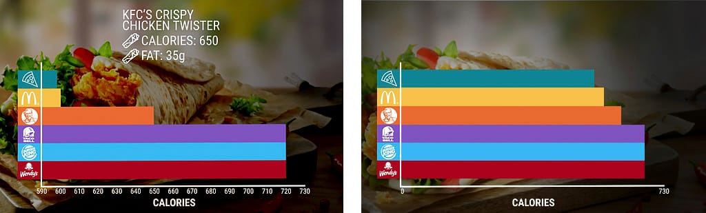
When KFC used a graph to illustrate the amount of calories in a Chicken Twister compared to, say, a Wendy’s burger, it looks as if the one has half the calories of the other. But note where the X axis starts. When you see the full X-axis from zero, it’s obvious that there’s very little difference between them.
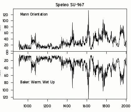
Another infamous example was Michael Mann’s Tiljander Sands graph. The Tiljander et al 2003 core samples of organic material in lake sediments were used as a proxy for global warming. The more organic material, the warmer the climate – so the reasoning went.
Standard practice is that the Y-axis starts at zero and counts up. That is: positive values at the top, negative values at the bottom. This is not just the standard we learned in high school maths, it’s the standard. But when Mann published his graphed data, he turned the Y-axis upside-down. The data was still the same but the story it appeared to tell was precisely opposite to the truth.
2. Misleading representation
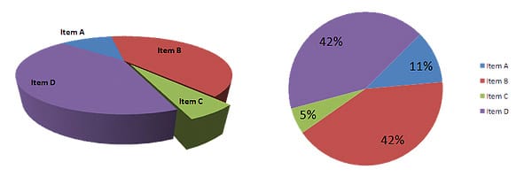
Graphs can look cool, but the way the same data are presented in different graphs can mislead. A bar chart might be better done as a scatter-plot. A 2D pie-chart shown in 3D makes it hard to genuinely compare the data slices.
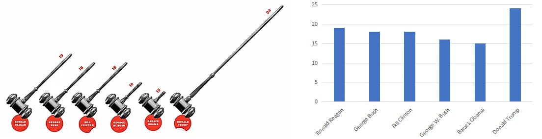
A graph with cool-looking judges’ gavels to show how many appellate judges U.S. presidents confirmed in their first terms is difficult to interpret. Especially when, like the KFC ad, it doesn’t use a baseline of zero. A plain bar graph is much clearer – but probably doesn’t give the impression its publishers wanted.
Another, particularly notorious, example is weather agencies using alarmingly-coloured maps to push their ‘climate crisis’ message. As comparison shows, earlier forecasts simply showed simple topographical maps with temperatures and innocuous symbols. More recently, though, in tandem with ramped-up legacy media hysteria over a supposed ‘climate emergency’, forecasts changed to ‘heat maps’, all alarming reds and oranges (‘hot’ colours’). As the comparisons show, despite having near-identical temperature ranges, the later maps are far ‘scarier’.
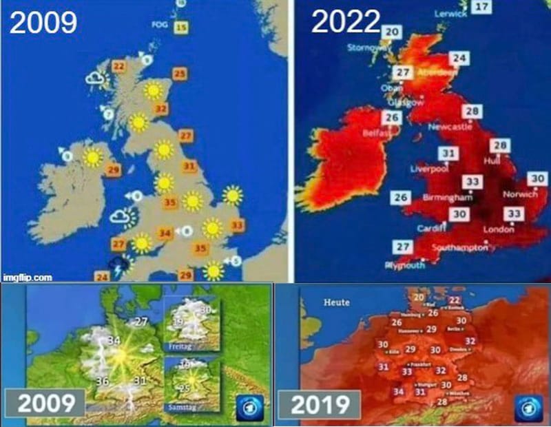
Of course, ‘fact checkers’ immediately rushed to ‘debunk’ the ‘hoax’, thus proving my Second Law of the Media: Always assume that “fact-checkers” are trying to bullshit you.
While they correctly said that the earlier maps were topographical, the later ones heat-maps, that ignores the two obvious questions. Firstly, why the change? Secondly, why are the heat-maps coloured in the most vivid ‘hot’ colours imaginable? In each case, the answer clearly appears to be that weather agencies are trying to slant the information in a more alarming fashion.
3. Selection bias
How you select which data to present can change the apparent picture enormously. For instance, the endlessly-cited claim of ‘97 percent of scientists…’ is based on several studies, each of which is little more than a textbook case of selection bias. For instance, the Doran study only surveyed self-selected respondents (i.e., people who were motivated enough to respond to a mail-out). Of the 10 thousand-plus scientists approached, only 3146 responded. From those, the study selected a mere 79 or 77 (depending on which of the survey’s two questions they were studying), supposedly “the most specialized and knowledgeable”.
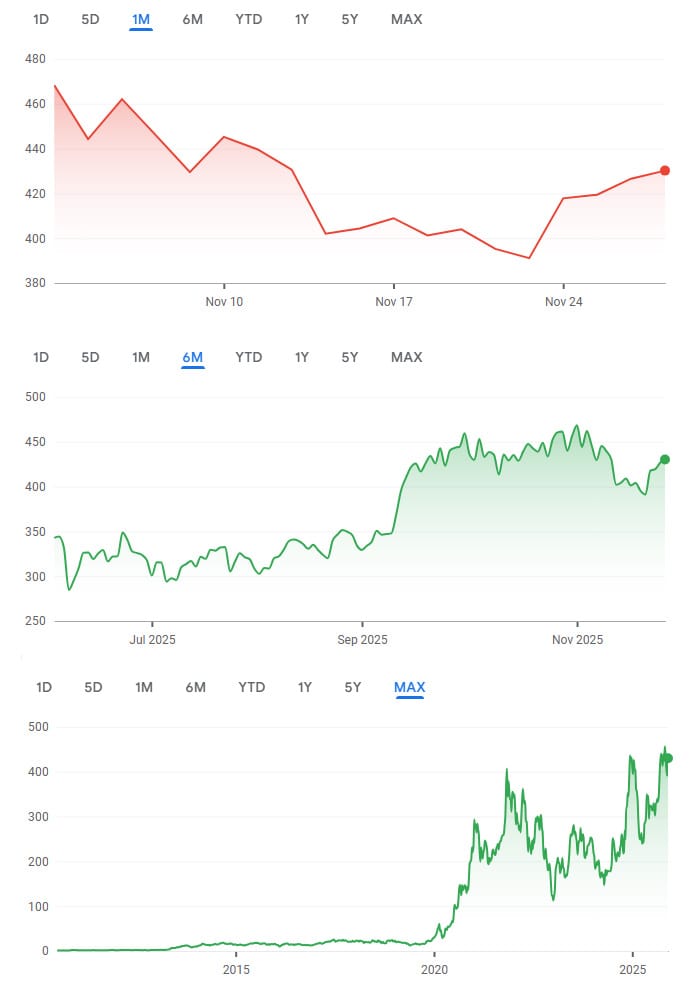
Another variation on this theme is, for time-related data, cherry-picking the time period. For example, looking at a company’s share price during only a bad (or good) quarter may give a totally different impression to a five-year trend.
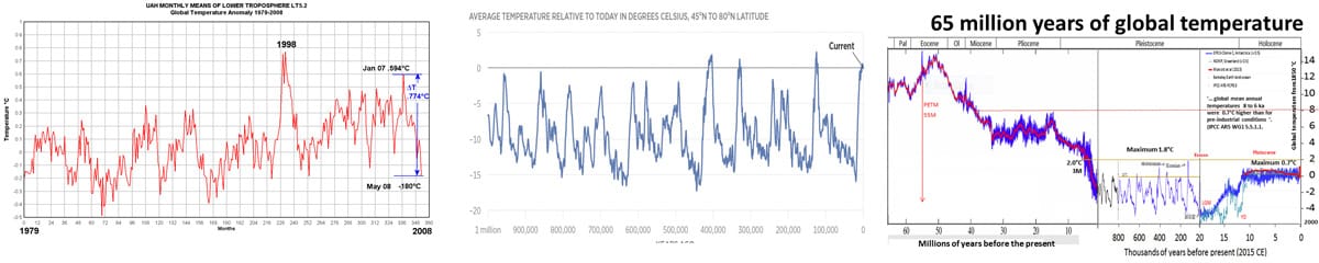
Similarly, looking at global climate reconstructions over a period of 100 years, one million or 65 million years also gives a very different picture of what may or may not be ‘normal’ or ‘unprecedented’.
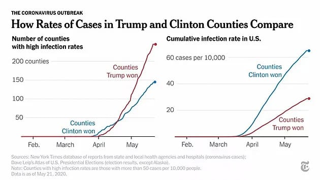
Even with much less subjective data, such as Covid-19 infections, data selection can tell two completely different stories. If you select merely the counties with high infection rates and then break them down by Trump or Clinton voters – oh! those idiot Trumpsters. But, if you compare different-voting counties to the total cumulative infections in the US – well, now it’s the Clintonistas’ turn to look pretty dumb.
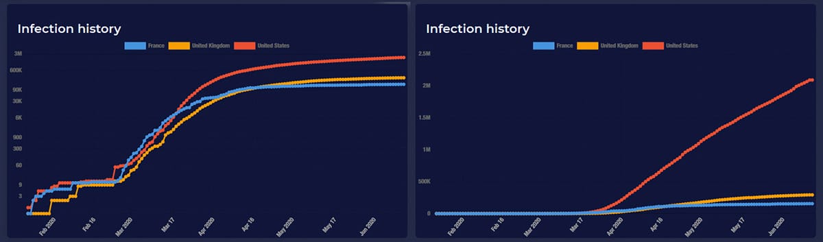
4. Watch out for logarithmic scales
“Logarithmic” means that each increment on the axis is multiplied from the last by a factor of 10 (e.g., 100, 1000, 10000, 100000 etc.). This can be very useful for presenting big numbers, but it can also be very misleading. Compare these two graphs. Same data – one on a linear scale, the other logarithmic.
These are just a few of the ways genuine data can be used to mislead the unsuspecting.
Statistics may seem like a dry and uninteresting subject, but it’s important to try and get even a rudimentary grasp. The more you know, the less easily you’ll be baffled by mainstream media bullshit.


