Table of Contents
This series is designed to help people to understand modern technology, and become more confident in using computing devices. It is not designed to educate experts.
The author is involved in tutoring older students at SeniorNet, a New Zealand wide organisation. SeniorNet hopes that students will feel more confident in using their computing devices as a result of the learning opportunities offered. This series of articles shares that hope.
In the Linux world I inhabit, choice is one of the major benefits I see. If I don’t like the way a particular brand of Linux does something, there is almost certainly another brand (distro) that will do what I want. Choice is something you either love or hate. I love choice. I always smile to myself when people tell me that there are too many choices in the Linux world. I wonder how they get on when it’s time to buy a new car. Or toothpaste. Or a TV. Choice is one of the outcomes of the capitalist economic system. If you don’t want choice, move to a communist country and see how enjoyable that is.
Today I want to introduce you to the menu system built into my KDE desktop. This gives me a number of different looks and approaches that I can easily swap between. Users of the other two major computer operating systems will be well aware of the angst that envelops their user base every time there is a change in this area. A good example is the recent change to the position of the menu in Windows 11. Moving it to the centre of the taskbar seems to have caused great consternation to the masses.

My KDE desktop currently offers six choices, three that are add ons from widgets and three that are part of the KDE installation. Let’s look at all of these.
Clicking on the Kmenu icon (analogous to the Windows Start icon) brings up my currently selected alternative, which is called Application Menu.
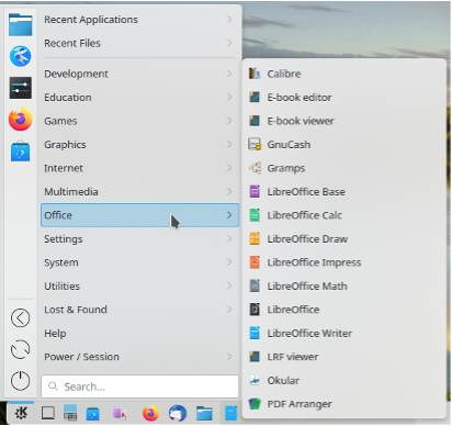
As you can see, it’s quite like the old Windows XP menu from years past. It includes power buttons (lower left) and favourite programs at upper left.
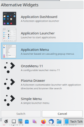
But if I don’t like this menu, right-clicking on the Kmenu icon and selecting “Show Alternatives” offers me a virtual cornucopia of choices. To switch to another menu layout just click the Menu name, and the Switch button. The new menu will be offered by clicking the Kmenu icon.
Yes, it’s that easy.
Here are the other five alternatives. You’ve already seen the Application Menu.
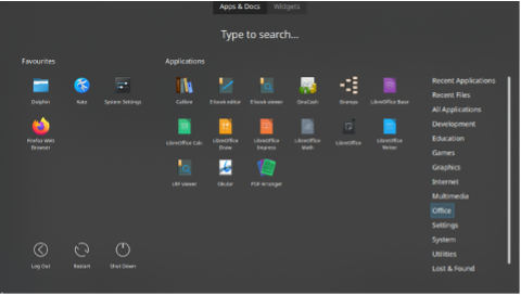
This is the Application Dashboard, a full screen menu showing the Office section.
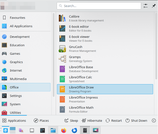
Here is the Application Launcher, similar to the Application Menu, but without the Favourites.
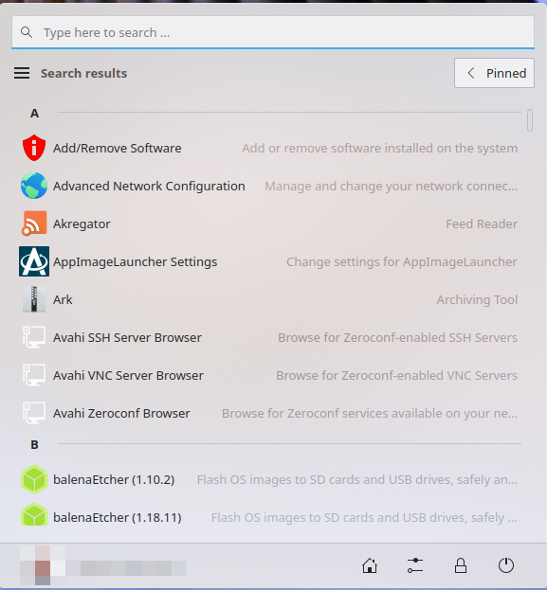
This is OnzeMenu 11, which appears in the centre of the Taskbar, and is analogous of the Microsoft Windows 11 menu which caused such comment when it was introduced. This menu was added to my menu collection by installing a widget, as are the other two following menus.
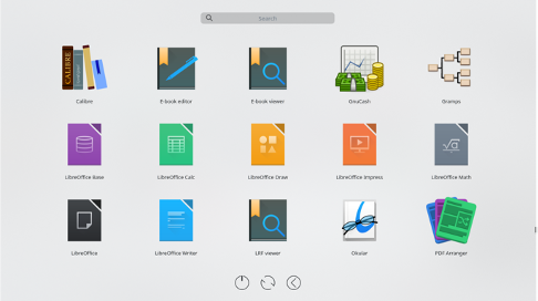
This is called the Plasma Drawer, and page one shows the various categories. The page shown is the items in the Office category. To return to the categories page just click on an empty area of the menu.
The final alternative menu layout is called a simple menu. This is opened to the Office category.
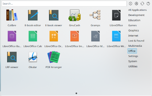
As you can see there are a number of different layouts and appearances, and there should be one to satisfy most tastes. I use the Application Menu as my daily driver, but it’s great to know there are alternatives should I become bored or disenchanted with today’s choice.
Choice is king for Linux.


