JD
With Chlöe Swarbrick’s ‘Watermelon Party’ in the news, pushing the current oil price shock as another reason to decarbonise before the apocalypse descends upon us, we should perhaps revisit the climate catastrophe narrative and establish its origins.
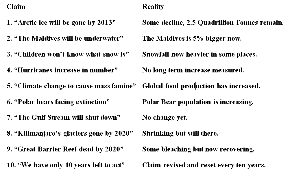
But first, for a perspective on the reality of the threat, let’s look at some of the claims that have been made and discredited since Al Gore kicked off the climate change industry in the 1980s.
To come up with the ‘top 10’, I asked for analysis by the all-seeing eye of AI.
Recognising that nonsensical scare tactics such as these continue to surface, and investigating the underlying sources of this hyperbole, we arrive at Representative Concentration Pathway (RCP) 8.5, one of a set of climate scenarios used by the Intergovernmental Panel on Climate Change (IPCC) to calculate temperature risks.
This RCP8.5 model, often referred to as the ‘business as usual’ case assumes such things as a world population of 12.5 billion and coal fired energy production up to seven times the current level by 2100.
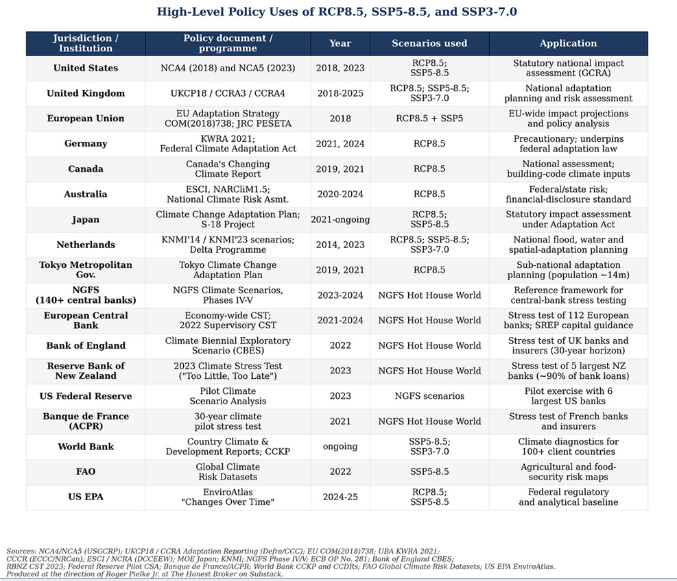
This scenario, as climate scientist Roger Pielke Jr(1) reports, “is not just an academic construct used in esoteric research. It is embedded in the policies and regulations of most of the world’s largest economies, found across the world’s most important multilateral institutions and used in the climate stress tests that govern hundreds of billions of dollars in bank capital.”
He also produced the following table to back up that claim:
Fortunately there is some good news on this front.
New scenarios have now been released by the Coupled Model Intercomparison Project (CMIP) – a project of the World Climate Research Programme (WCRP), co-sponsored by the World Meteorological Organization, the International Science Council and UNESCO’s Intergovernmental Oceanographic Commission.
The sub-committee of the Scenario Model Intercomparison Project (ScenarioMIP) just published its report to the CMIP on the new framework which will underpin the IPCC’s Seventh Assessment Report (AR7) and much of the research that it will draw upon.
Supporting this is a new scientific paper (by Detlef van Vuuren and others(2)) that marks an important shift in climate science.
Its central point is that they finally recognise the highest emissions pathway – RCP8.5 (and its successor SSP5-8.5) – is now considered “implausible”.
The new work narrows the likely range of future emissions and shifts attention toward mid-range scenarios as more realistic.
This is a major course correction, with implications for:
- how climate risks are communicated
- how policy is justified
- how future research is framed
Reading of the new scenarios suggests a possible century end temperature rise in the two per cent CO2 increase range, approximately half of the now discredited RCP8.5 forecast of four per cent or more. Much of this change results from more realistic assumptions on coal fired power generation (nuclear anyone?) and of 15–20 per cent fewer in the population estimate versus the 12.5 billion of RCP8.5.
However, given that the new population figures being used are still probably overstated as fertility trends ever downward across the world, it is very likely that the temperature increase by 2100 will be even less than for two per cent. Good news all round.
Moving on, and looking behind the curtain to find out exactly who are the assessment modellers developing these CMIP scenarios, it gets even more interesting.
To quote Pielke Jnr again:
The Coupled Model Intercomparison Project (CMIP), now in its seventh phase (CMIP7), is the international scientific group under the World Climate Research Program that oversees official projections of climate futures. CMIP scenarios drive the temperature and emissions projections that anchor every Intergovernmental Panel on Climate Change (IPCC) assessment and much more:
· The projections inform national climate-impact assessments in the United States, the United Kingdom, Germany, Canada, Australia, Japan, the Netherlands, and many more.
· They drive sea-level-rise estimates that local governments use to plan coastal infrastructure.
· They also shape projections of future climate damages, such as in estimates of the “social cost of carbon,” which has played a key role in US federal regulatory analysis.
· The projections also inform the Network for Greening the Financial System (NGFS) scenarios that more than 140 central banks and supervisors are required to use to stress-test commercial bank capital requirements.
· They form the climate diagnostics that the World Bank’s Climate Change Knowledge Portal provides for over 100 client countries, informing national and local decision making related to climate risk.
It is no exaggeration that the CMIP climate projections influence trillions of dollars in investment and regulation. They are, in functional terms, among the most consequential 21st century scientific products designed to inform policymaking, economics, and regulation.² They are not just about science, but about science advice to policymakers in government, business, and civil society.
So who are these shadowy figures of whom I’ve never heard; something I suspect is also true of 99 per cent of other Kiwis?
It turns out the CMIP scenarios are developed by a relatively small community – around 200 ‘integrated assessment modellers’ across about 15 institutions, heavily concentrated in two centres: IIASA (the International Institute for Applied Systems Analysis) in Austria and PIK (the Potsdam Institute for Climate Impact Research) in Germany. Many of these individuals have led scenario development for decades, remaining central across multiple generations of models.
As a result, responsibility for shaping climate scenarios has largely stayed within a small, consistent group of researchers and institutions.
But here’s the kicker: IIASA and PIK receive significant funding from climate-focused advocacies such as ClimateWorks and Bloomberg Philanthropies whose backing of these modelling efforts has an indirect, but nonetheless real, influence on financial systems globally.
An IIASA researcher notes that central banks require commercial banks to use these climate scenarios for financial stress testing. As the same modellers developing these scenarios receive funding from advocacy organisations, it raises major concerns about overlap between scenario design, policy influence and funding sources.
As Pielke Jnr further notes:
These cozy relationships among a very small group of institutions and individuals coupled with their outsized influence in global science, finance, and policymaking raise a lot of questions. The figure below shows that across the new CMIP7 scenario paper and dataset, 36 unique institutions appear as primary affiliations.
• Fifteen are in Europe (42 per cent of the total).
• Six are in the United States, the only North American country represented (another 17 per cent).
• Five are elsewhere in Asia (Japan and Pakistan).
• Two are in India;
• One is in China; three in South America; two in Africa; two in Oceania (Author’s note:-NZ is not represented)
Sixteen of the 29 listed creators of the CMIP7 scenario dataset are at IIASA or PIK.
Thus we have climate-scenario evolution heavily dominated by Europe and the United States, with limited representation from major developing regions.
This imbalance raises concerns about lack of diversity and under-representation of the global South in shaping scenarios that influence global policy.
Major emitters such as China, India, and developing regions including Africa and South America are minimally represented in CMIP7, despite being most affected by long-term climate pathways.
At the same time the scenario process lacks transparency, formal governance structures, and public accountability, highlighting the need for stronger oversight and more inclusive representation.
Currently we have a group of people, funded by in part by climate change alarmists, deciding what the scenarios that underpin climate change assessments have been for decades, and will be into the foreseeable future. Biased? You be the judge.
However there is one bright spot, given that even these groups have now discounted RCP8.5 as “implausible”, we might expect that existential climate alarmism grounded in the RDP8.5 scenarios will at least be somewhat muted from now on. (Breath retention practice anyone?)
Finally, and irrespective of which scenarios are used for long term projections, it is enlightening to consider where New Zealand sits right now when it comes to our own contribution to worldwide emissions.
It is often said that any claims that our emissions are miniscule misrepresents the fact that on a per capita basis they are up to four times the global average and as Chlöe loves to tell us (when she has any spare time left over from freeing Palestine) – WE MUST DO SOMETHING ABOUT IT!
So let’s unpick this and come up with some realistic numbers.
Firstly our per capita CO2-equivalent (CO2-e) gross emissions came in at 16–17 tonnes per person/year and, compared to a world average of four to five tonnes, they are indeed four times as high.
However if we apply all of the offsets from our forestry carbon sink, the NZ figure drops to 10–12 CO2-e tonnes per person/year.
Additionally we need to recognise that our agricultural emissions, which are roughly 50 per cent of the NZ total, support exports that feed the equivalent of 25 million people.
Spreading these emissions over that base brings the per capita figure down to 2.5 CO2-e tonnes per person equivalent.
This is one of the lowest in the developed world. In fact NZ is less a ‘heavy polluter’ and more a small population servicing a large global food demand.
Since any reduction we make to our agricultural sector simply transfers that production to less efficient countries elsewhere, effectively increasing worldwide emissions, clearly that’s not the answer. So where else could we cut?
The only real opportunity lies with our energy sector outputs, which amount to approximately ~29 Mt CO2-e per year. This could be reduced by shifting the four million plus NZ vehicle fleet to EVs, but that would cost Joe Public literally billions of dollars and drive electricity prices into the stratosphere, choking business and industries alike.
And the outcome? Total elimination of NZ’s energy sector emissions, projected over the rest of the century would reduce global temperature by one thousandth of one degree Celsius.
This is a figure so small it’s effectively imperceptible and far below margins of error in any temperature that instruments measure. Less even than the effect that opening your fridge door for a few seconds has on the temperature in your whole house!
Summarising:
1. Virtually none of the climate apocalypse claims that have been made since the climate change industry was kicked off by Al Gore in the 1980s have come to pass.
2. The climate change ‘scenario forecasting’ industry is compromised by climate change advocacy funding. Additionally it is heavily skewed towards Northern Hemisphere inputs, particularly from two main sources: IIASA in Austria and PIK in Germany.
3. NZ is one of the lowest ‘per capita equivalent’ emitters on earth, and, agriculture aside, the most we could even attempt to do would reduce global temperatures, over the next 75 years, by one thousandth of a degree. Assuming of course that Joe Public could afford to foot the bill as we risk destroying what’s left of our economy in the process.