Table of Contents
Peter MacDonald
The maps on our classroom walls have shaped our understanding of the world and ourselves. But what if I told you those maps are lying...
Since World War II, most Western schools have used the Mercator projection: a map originally created by Flemish geographer and mapmaker Gerardus Mercator in 1569. Designed primarily for navigation, it became the standard in the 18th century because it represents rhumb lines (constant compass bearings) as straight lines, making it ideal for sailors. However, when applied to world maps, the Mercator projection inflates the size of lands the further they are from the equator. This means landmasses such as Greenland and Antarctica appear far larger than they actually are relative to lands near the equator.
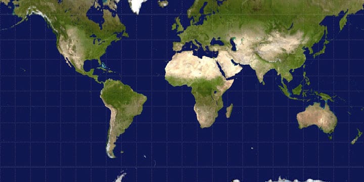
This projection inflates Northern Hemisphere countries, making colonial powers like Britain, the US and Russia appear dominant while shrinking countries in the Global South. Europe and North America loom large, while Africa, the second-largest continent on Earth, appears almost modest. Greenland looks nearly the same size as Africa, despite being 14 times smaller.
This isn’t just a mistake: it’s a worldview.
Most people grow up never realising that Africa is over 11.7 million square miles, while Russia is just 6.6 million, meaning Africa is nearly twice the size of Russia. Yet Mercator-style maps flip that visual reality on its head.
Even New Zealand is misrepresented.
We’re often seen as small and insignificant: a ‘bottom corner’ country. But, in reality, New Zealand spans 103,500 square miles, while the entire United Kingdom covers only 93,600. That’s nearly 10,000 square miles smaller. In acreage, New Zealand holds 66.2 million acres, compared to the UK’s 59.9 million – over six million acres more. The perception of size, scale and importance is manipulated – not always intentionally – but effectively.
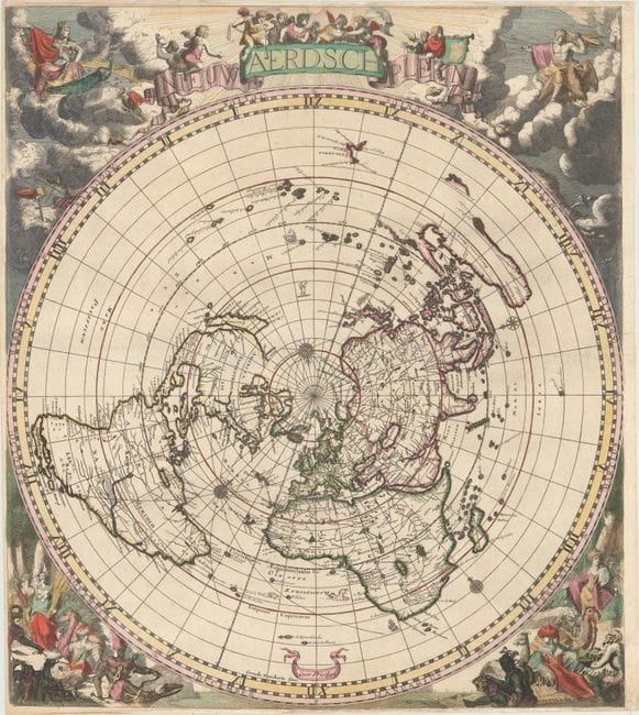
Older maps told a different story.
One striking example is the “Nieuw Aerdsch Pleyn” (New Earth Plain), created by Jacobus Robijn in the late 1600s. This polar projection map, rooted in Dutch seafaring science, displays Africa and South America in their correct proportions: vast and commanding. It was during this same era, in 1642, that Abel Tasman, sailing under the flag of the Dutch East India Company, became the first known European to chart parts of New Zealand. These maps reflect a truer geography before empire and propaganda redrew the globe for power’s sake.
Even pop culture has flagged this. In The West Wing, season two, episode 16, a fictional group called the Organization of Cartographers for Social Equality presents the Gall Peters projection to the White House. Their point...That map bias reinforces power structures and shapes how generations view the world and its people.
Why does this matter...
Because how we see the world shapes how we treat it. If a map minimises Africa and enlarges Europe, we unconsciously accept a hierarchy of power, culture and value. This goes far beyond geography: it feeds into foreign policy, aid, immigration and global inequality. It’s not just a map, it’s a message.
This distorted worldview is no accident. It shows the lockstep narrative globally projected by world federalist interests and reveals the true power of psychological propaganda. One simple map, given to every country’s children in schools and used in commerce worldwide, becomes a powerful tool to shape perception and control the narrative.
It’s time we looked again: not just at geography, but at the deeper assumptions etched into our culture. The cartographers of old, like Robijn and Gerardus Mercator, gave us tools to explore the world. Let’s not let modern bias redraw their legacy.
It’s time our maps told the truth.