Table of Contents
Gus Hubbard
Gus Hubbard’s career and lifelong passion are in the field of mathematics education at all levels from new entrants to tertiary.
Let me begin by saying my interest is in mathematics rather than politics.
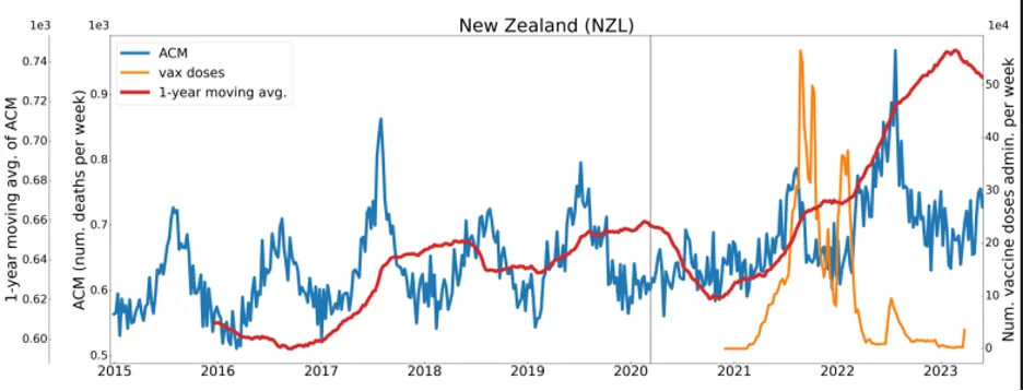
An acquaintance who was recently visiting on another matter, and who is aware of my statistical background, left me the following graph with some other material he was dropping off.
It can be found, along with graphs for several other countries, on p. 21 of the following article whence it comes.
If I were still teaching courses in statistics, I would draw students’ attention to the fact that the graph is presenting NZ weekly deaths, in thousands, from all causes (the blue data), and an annual moving average (the red line), which at any point gives the average number of deaths per week for the twelve months immediately prior to that point. This is the purpose of a moving average – to compensate for the ups and downs of seasonal variations (more deaths over the winter period) to show longer-term trends. At any point, its value must lie between the upper and lower limits of the data for the preceding 12 months.
Then I would invite the students to, firstly, simply look at the graph and see what impression it gives them; and secondly, look more closely and analyse what is happening here.
I invite the reader to pause and do exactly the same thing before reading further – to simply react and say ‘what is this graph telling me?’ and then to delve deeper.
I would expect that overwhelmingly people will notice the much higher position of the red line at the end of the graph which indicates that average deaths have risen alarmingly after the administration of the Covid vaccine, which is obviously the cause of a huge number of excess deaths. Bingo! You’ve bought the lie.
How has the scammer, one Dr Joseph Hickey, managed to sell you this pup?
Look at the left-hand scales and notice that there are two of them – one for plotting weekly data and the other for plotting the moving average. This is a contrivance, probably a Hickey original, by which the illusion has been created. The moving average should be plotted, and always is by reputable statisticians, on the same scale as the raw data.
Notice how the moving average scale has been stretched out. Take the high-end red line peak and read back to the moving average scale – about 0.74. Now go to 0.74 on the weekly data scale and take that across – that is where the red line should be: just above the blue data. It is slightly above the weekly data because the effect of the winter 2022 peak is still included in the 12-month average.
Notice also how the two scales Hickey uses have the same value at around 0.64. This means that for the initial part of the graph, where weekly deaths are centred around this value, the red line is more or less where it should be, and the trickery passes unnoticed.
I have a degree of sympathy for Dr Hickey. He works for an organisation called Correlation. The biographical notes there tell us that he lost his previous job at the Bank of Canada because he refused to submit to Covid vaccination. Just as many Kiwis did. An outrageous violation of civil liberties.
Understandably, he is upset. He may genuinely believe that vaccination caused many complications and killed many people. Did it? I don’t know. I have an open mind on the question. But when people deliberately distort the truth to push their point of view I am not impressed and am inclined to be suspicious of their cause. Why would you need to lie if the truth is on your side?
I look at the blue raw data and don’t see any marked increase in deaths post-vaccination. They may be there but not of sufficient magnitude to be apparent. They may or may not be a factor. I’d welcome a truth-seeking investigation.
Dr Hickey’s organisation, Correlation, has the by-line ‘Research in the Public Interest’. Is it ever in the public interest to distort the truth to support your position? Remember Arthur Thomas, Teina Pora, Alan Hall and others. Unscrupulous cops who believed in their guilt (or maybe didn’t but just didn’t care) withheld or falsified evidence, manufactured it or even planted it and convicted innocent men.
Dr Hickey went to the same school of integrity. This graph is not the work of an uninformed, bumbling amateur but of a knowledgeable, but unprincipled, manipulator with an axe to grind.
H G Wells once said, “Statistical thinking will one day be as necessary for efficient citizenship as the ability to read and write.” That day has arrived. Sadly our schooling system has not. As well as the incompetence of the Numeracy Project in early school years, much NCEA content, such as quadratic equations and differential equations, are of no practical use at all to Joe Citizen. They do not occur in our everyday life. Statistical ideas do.


