
Table of Contents
Alia Bland
voicesforfreedom.co.nz
Information
Opinion
Dangerous, misinformation-spreading loons.
Our organisation is regularly on the receiving end of these kinds of labels.
But what happens when the information we are “spreading” is their own?
Namely, data and charts from a publicly respected national mainstream media source?
In the past, sharing inconvenient research, data and stats saw us de-platformed from social media sites like Facebook and YouTube.
Thou shalt not share problematic truths.
Disappearing data
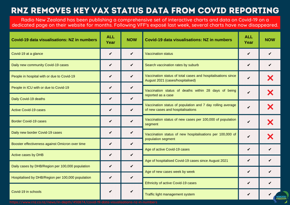
On Friday, I wrote a post about several key Covid-19 cases and hospitalisation charts published on the Radio New Zealand (RNZ) website.
These charts were derived from Ministry of Health numbers and looked at the data surrounding the vaccination status of the recent Covid-19 cases, hospitalisations, and deaths.
In a nutshell, it showed that the boosted make up more than their fair share of the percentages, especially when it comes to being hospitalised or worse.
Awkward.
Last year, when too many people discovered similar patterns of infection and hospitalisation amongst the vaccinated in the UK (via their regular Public Health England Technical Briefing Reports), they officially changed how they shared their information to obscure and omit uncomfortable findings.
It seems our very own national broadcaster has opted for the same strategy in NZ.
It would appear that RNZ has pulled five charts displaying data relating to vaccination status from their webpage – within a day or two of us highlighting the results.
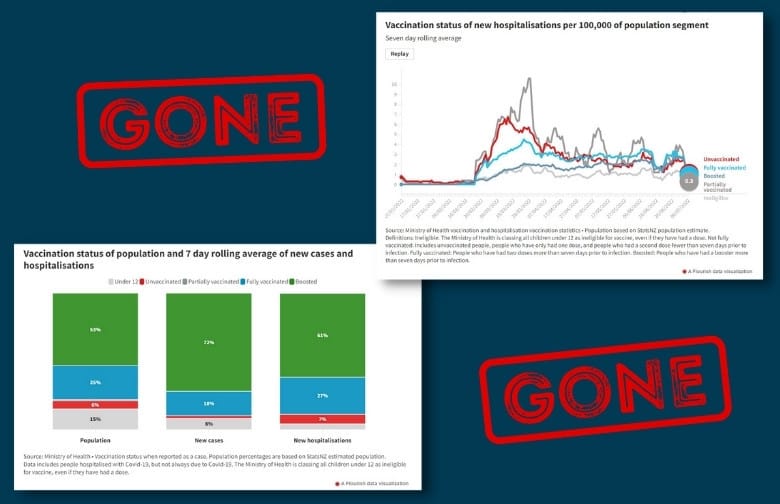
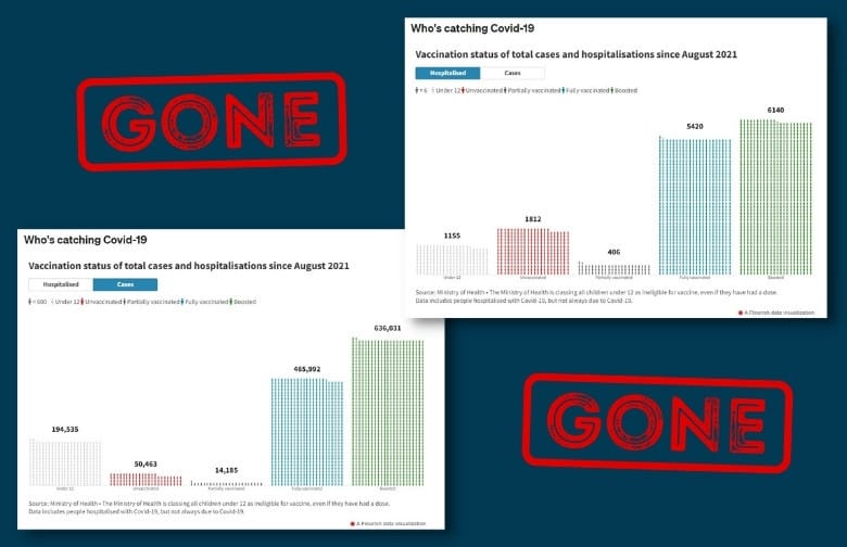
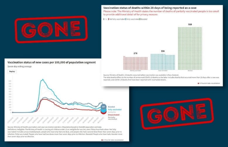
Coincidence? Perhaps. But after many months of regularly updating and displaying this information for the public’s benefit, the timing of this deletion is undoubtedly curious.
So, what should we do about it?
While RNZ is under no obligation to publish this information, we think they have until now been providing a public service to the people of NZ with these easy-to-read charts.
We hear much about transparency and the importance of people accessing accurate information from trusted sources. So, let’s hold them to it!
If, like us, you’re deeply concerned about the removal of information from this public space, then consider letting RNZ know.
Write to them and ask:
- Where have these charts gone?
- Why were they removed?
- When can we expect to see them reinstated?
- And why have the mainstream media not highlighted the results in their reporting?
You can find contact details for RNZ here: https://www.rnz.co.nz/about/contact
Let’s fill their inbox with polite yet pressing requests for transparency!
REFERENCE: https://www.rnz.co.nz/news/in-depth/450874/covid-19-data-visualisations-nz-in-numbers


