Table of Contents
Lindsay Mitchell
Lindsay Mitchell has been researching and commenting on welfare since 2001. Many of her articles have been published in mainstream media and she has appeared on radio, tv and before select committees discussing issues relating to welfare. Lindsay is also an artist who works under commission and exhibits at Wellington, New Zealand, galleries.
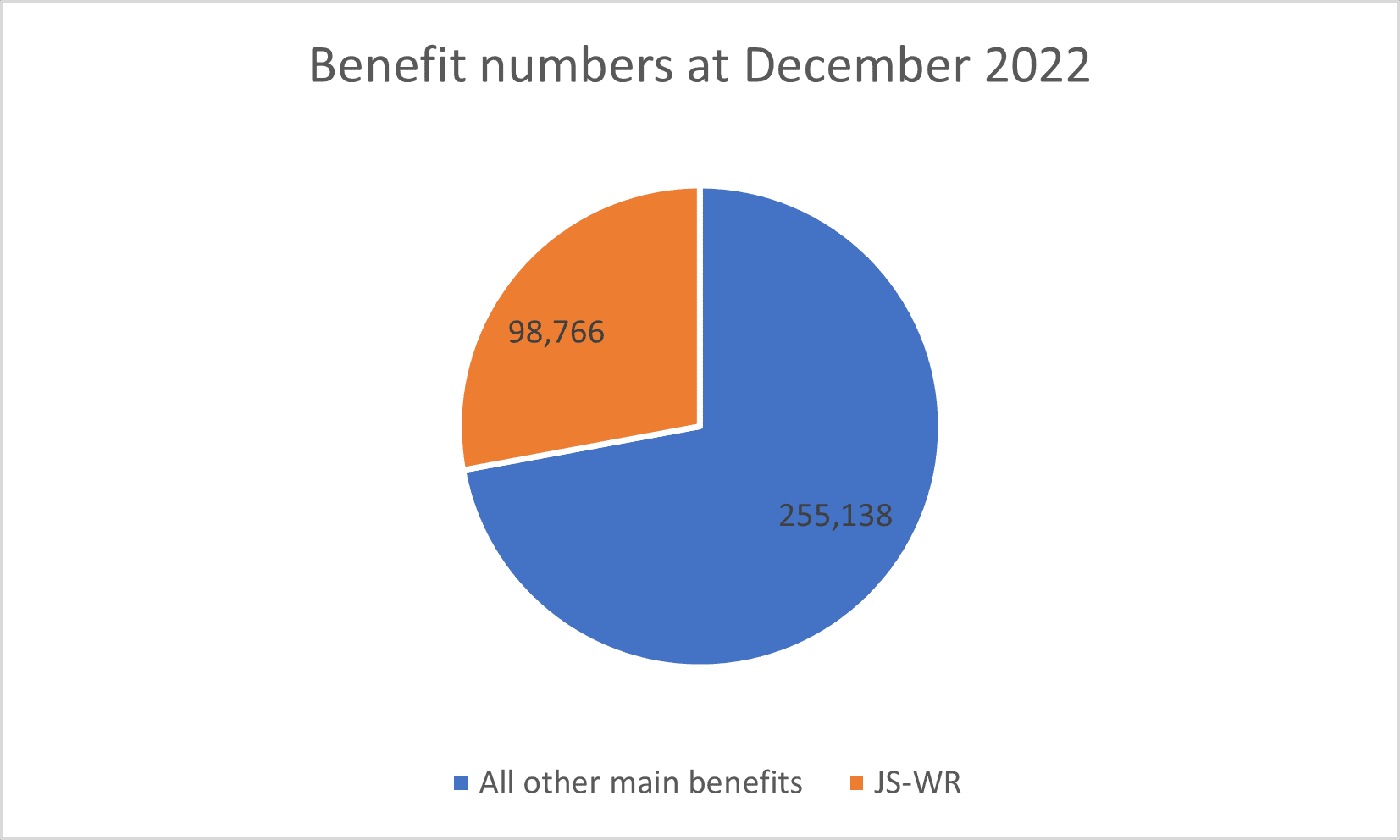
The disconnect between the unemployment rate (3.4% or 99,000) and the number of people on a benefit (11.3% or 353,904) has many scratching their heads. I get asked about it a lot.
At December 2022 the Jobseeker Work Ready (JS-WR) total was 98,766. Pretty well on the mark.
But this leaves a quarter of a million people over and above the officially unemployed count and receiving an income from the state.
They are either too sick to work or have child-minding responsibilities.

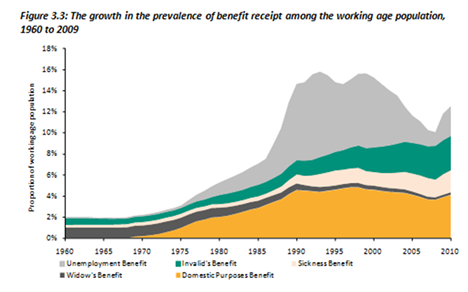
Now to put that into long-term perspective consider the following graph:

In 2010, when the effect of the GFC was evident, around 13 per cent were on a benefit. Now it’s 11.3 per cent but the proportion made up by the underlying layers remains the same (albeit with different labels.)
Most working-age welfare benefits were introduced in the late 1930s and for the next 30 years recipients comprised just two per cent of the population and were overwhelmingly widows and invalids. The explosion in welfare began from the mid-seventies.
Getting to my point, while unemployment fluctuates the underlying core of sick people or sole parents is entrenched. The economy has to carry this population whether times are good or bad, whether there are jobs or not.
WHY this situation has developed – or been allowed to develop – could fill a thesis. But many of you will have lived through the entire period and can probably share some valuable observations. Feel free.


